Plotly的Python图形库使互动的出版质量图表成为在线。 如何制作线图,散点图,面积图,条形图,误差线,箱形图,直方图,热图,子图,多轴,极坐标图和气泡图的示例。推荐使用jupyter notebook来展示Plotly的画图效果。如果不去按照本地实验,也可以在官方的线上demo中操作展示。
友情提示:网上很多的Plotly教程提供的代码示例内容很有可能已经过时,大家学习时尽可能的去官方网址的最新Demo或者API中查看具体的使用方式,例如很多文章的代码示例会提到一个import的包就已经在最新的版本中不做历史兼容了
import plotly.plotly as py 这样引入的时候在新版本中会包该模块已经被合并到chart-studio中,这个时候就要从新安装这个包,并从这个包中引入该模块。
1、安装
pip install plotly
2、代码示例
闲话少扯,直接上一些代码示例来简单撸一下效果。
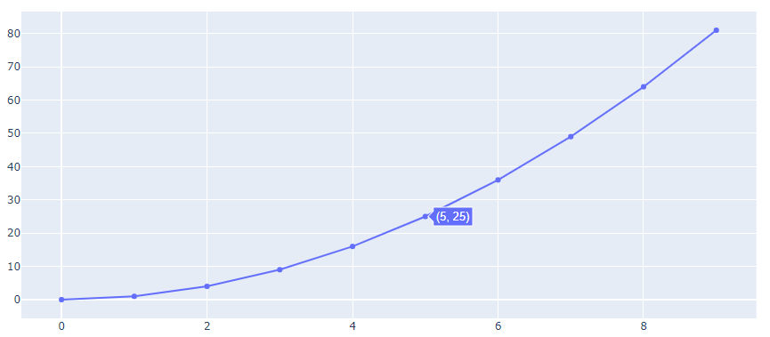
2.1 线图
import plotly.graph_objects as go
import numpy as np
x = np.arange(10)
fig = go.Figure(data=go.Scatter(x=x, y=x**2))
fig.show()
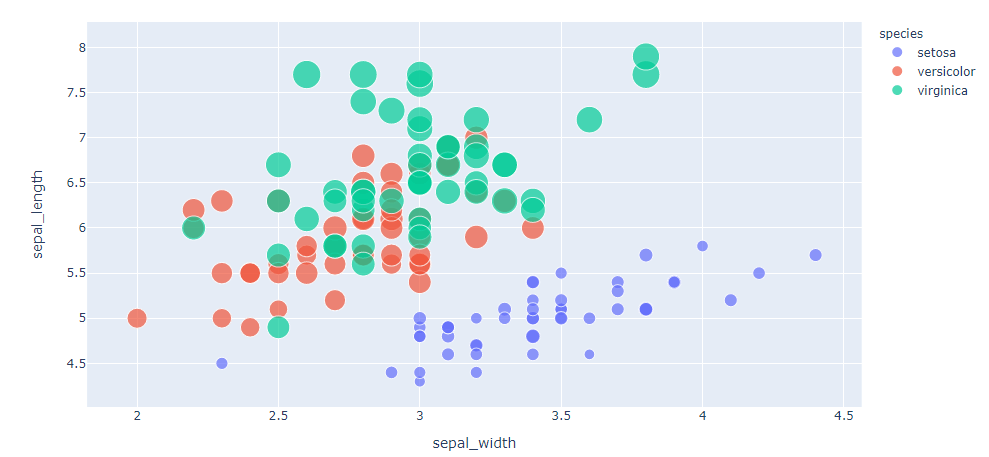
2.2 点图
import plotly.express as px
df = px.data.iris()
fig = px.scatter(df, x="sepal_width", y="sepal_length", color="species",size='petal_length', hover_data=['petal_width'])
fig.show()
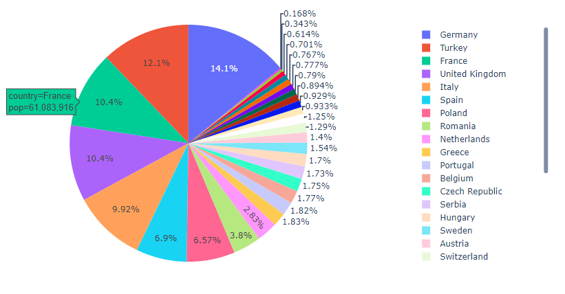
2.3 饼图
import plotly.express as px
df = px.data.gapminder().query("year == 2007").query("continent == 'Europe'")
df.loc[df['pop'] < 2.e6, 'country'] = 'Other countries' # Represent only large countries
fig = px.pie(df, values='pop', names='country', title='Population of European continent')
fig.show()
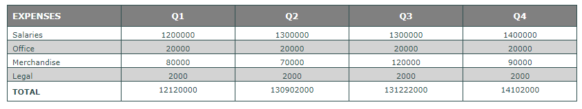
2.4 表格
import plotly.graph_objects as go

headerColor = 'grey'
rowEvenColor = 'lightgrey'
rowOddColor = 'white'

fig = go.Figure(data=[go.Table(
  header=dict(
    values=['<b>EXPENSES</b>','<b>Q1</b>','<b>Q2</b>','<b>Q3</b>','<b>Q4</b>'],
    line_color='darkslategray',
    fill_color=headerColor,
    align=['left','center'],
    font=dict(color='white', size=12)
  ),
  cells=dict(
    values=[
      ['Salaries', 'Office', 'Merchandise', 'Legal', '<b>TOTAL</b>'],
      [1200000, 20000, 80000, 2000, 12120000],
      [1300000, 20000, 70000, 2000, 130902000],
      [1300000, 20000, 120000, 2000, 131222000],
      [1400000, 20000, 90000, 2000, 14102000]],
    line_color='darkslategray',
    # 2-D list of colors for alternating rows
    fill_color = [[rowOddColor,rowEvenColor,rowOddColor, rowEvenColor,rowOddColor]*5],
    align = ['left', 'center'],
    font = dict(color = 'darkslategray', size = 11)
    ))
])

fig.show()
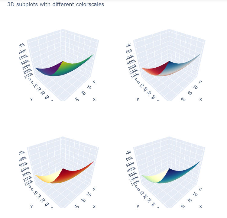
2.5 3D图
import plotly.graph_objects as go
from plotly.subplots import make_subplots

import numpy as np

# Initialize figure with 4 3D subplots
fig = make_subplots(
    rows=2, cols=2,
    specs=[[{'type': 'surface'}, {'type': 'surface'}],
           [{'type': 'surface'}, {'type': 'surface'}]])

# Generate data
x = np.linspace(-5, 80, 10)
y = np.linspace(-5, 60, 10)
xGrid, yGrid = np.meshgrid(y, x)
z = xGrid ** 3 + yGrid ** 3

# adding surfaces to subplots.
fig.add_trace(
    go.Surface(x=x, y=y, z=z, colorscale='Viridis', showscale=False),
    row=1, col=1)

fig.add_trace(
    go.Surface(x=x, y=y, z=z, colorscale='RdBu', showscale=False),
    row=1, col=2)

fig.add_trace(
    go.Surface(x=x, y=y, z=z, colorscale='YlOrRd', showscale=False),
    row=2, col=1)

fig.add_trace(
    go.Surface(x=x, y=y, z=z, colorscale='YlGnBu', showscale=False),
    row=2, col=2)

fig.update_layout(
    title_text='3D subplots with different colorscales',
    height=800,
    width=800
)

fig.show()

近期评论